John Wyndham Covers Part 3: WEB
The sixth novel I did in this John Wyndham series was Web, a book that was never published during the author’s lifetime. Written in 1968, the year before he died, it was only released in 1979. Of all of them that I’ve read it verges most convincingly into the realm of horror. It also is notable as the work of a member of an older generation (he was born in 1903) grappling with certain kinds of social change and movement of the late sixties that was mostly the province of the young.
The story begins by chronicling the recruitment of members into a utopian community, which has acquired an uninhabited island in the Pacific, Tanakuatua, to relocate and live out their particular egalitarian social vision. The project goes awry once the colonizers arrive. It turns out that the previous inhabitants of the island had been forcibly removed by the UK government because of nuclear testing being conducted upwind on another island many years before, and in the intervening time the island has undergone a transformation, maybe because of those tests, maybe by the designs of those forcibly expelled earlier inhabitants.
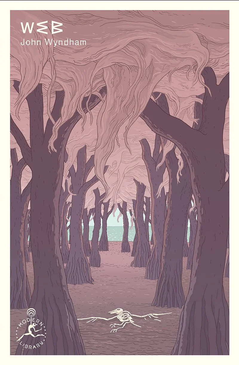
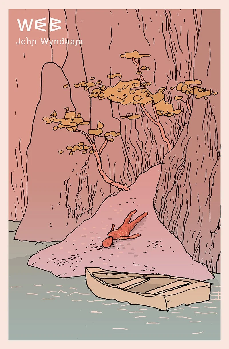
The final cover is above. Sketches are below. And I’ll show a few earlier versions of covers by other artists, at the end of this post, and talk about certain decisions I made that relate to them. But hopefully it’s clear, looking at these sketches that one thing I did not do was draw literal (or at least obvious) webs. But more about that below.

The other main decision I made early on was to play with the type in some way that might suggest the weirdness and dislocation, and in a way the ‘witchiness’ of the book. The word ‘Web’ is, as a title, such a small, economical unit, it felt like a nice opportunity to do something simple and graphic, within the constraints of the template I’d set. And it immediately became clear that the capital forms of the three letters are actually very closely related in their structure. I played around with a couple of different ways of repurposing each letter to create the other two. Ultimately making all three out of the capital ‘W’ seemed to be the simplest, most direct solution.
Web was the sixth book I worked on, and so it was the sixth book of Wyndham’s that I read. And it was, again, interesting both as a book unto itself, and as a time-capsule from an earlier era that we should all probably be grateful to have left behind. If you think you might read the book, the next paragraph has spoilers. Fair warning. Just scroll down if you want to see those other versions by earlier artists. Although, as I mentioned above, they too, have spoilers.

The book is clearly inspired by counterculture movements of the time – the late 1960s – but completely devoid of any of the counter-cultural trappings of long hair, rock music or drug use that we now associate with the changes of the time. This was interesting to me as the child of parents with vaguely related aspirations at that time. But it also struck me as telling. Wyndham seems sympathetic to the era’s anti-establishment philosophical impulses, and seems to connect them to his own philosophical and literary musing by use of the more of the philosophizing characters that populate all his books. But he seems utterly uninterested in the trappings and therefore the familiar, subtle flavors of these movements that we associate with them now, being about forty years too old to truly relate at the time.

There’s another even more palpable peculiarity to Web. Reading a quick synopsis, like the one at the start of this post, one might expect a post-colonialist tension: the home of pacific Island natives forcibly removed by an alien, European power becomes, itself, hostile. And indeed Web is, in part, an attempt to grapple with the legacy of empire in a way. But as with the author’s gropings toward feminist critique in other books, it feels a little awkward from the vantage point of 2022.
The previous inhabitants of Tanakuatua, we are told, were actually colonizers themselves, aboriginal to another nearby, larger island. Having displaced the original occupants, they are, nevertheless closely identified with the place, and are depicted almost as communing with the spiders, the book’s monstrous foil, facilitating their metamorphosis (possibly) and the the attacks on the newcomers (definitely). The book is pretty clearly intended as a sort of classic literary caution to hubris, both technological and colonial. The nuclear tests, it is suggested, may be the source of the spiders’ remarkable evolution and the previous inhabitants, having no other recourse to take revenge for their dislocation are assisting the spiders’ attacks, and their possible dispersion outward into the rest of the world. The means of this assistance are allowed to hover suggestively, and unfortunately stereotypically, between being magic and just being a deep connection to the land and its pharmacological/mystical potential.
So in a way Wyndham is attempting a sort of critique of something he is deeply embedded in. Which is arguably a problem any antagonist to unjust systems will have to try and wrestle with. He can try and articulate the problems, but ultimately the characters he identifies with, the society of which he feels most protective, is his own. Britain, Europe, the U.S., the West.
Finally, here are some of those earlier versions, and a bit about how I tried to approach the cover differently.

As I suggested above, all the cover treatments that I’ve seen for this book all depict either literal webs or the book’s spider antagonists. Which seemed to me to be exactly and obviously wrong and redundant, even apart from spoiling the pleasure of the book’s mysterious, dread-soaked first third – the author doesn’t introduce the spiders until things have already begun to go haywire for the utopian protagonists.
But as a cartoonist, first and foremost, but also as an illustrator, a cardinal rule is that the image and the text should never be doing the same thing.
The word ‘illustration’ has a common pejorative sense, in which an image is ‘just’ illustrating something – that it is pointlessly depicting something that the text has already spelled out without really adding anything substantive. The best illustration on the other hand adds something new to whatever text it accompanies, something that casts the the book or the article in a different light, or deepens its resonance. And these are not just arbitrary aesthetics, it has to do with our literal brain structure.

The left side of our brains process text and language and literal meanings, the right brain processes images and metaphors (and music, but that’s a somewhat different story). Everything interesting that happens in the spinning of words and images comes from the slight mismatch of those two sides of the brain trying to create a useful, meaningful facsimile of the world. So to simply depict images of a literal spider’s web, under the title “Web”, as two of the attached covers do (below), is, as far as I’m concerned the worst variety of artistic malpractice and mediocrity. If the title says it, the image should definitely not.
And depicting spiders is only one step removed (above). It immediately signals to the left side of your brain exactly how to interpret, in the least open-ended way possible, what the word Web should be understood to mean. It tells your right brain, don’t worry, there’s nothing interesting happening here you need to spin meaning out of. Any broader inventing your brain might want to do with the word web – about, say, general interconnectedness or a metaphorical matrices of entanglement – gets instantly jettisoned in favor of the more pedestrian “the thing that spiders make”.
These approaches are also a classic case of the cover showing you too much and ruining the well-drawn dread-soaked build-up the author took so much care to detail – the spiders don’t actually show up until after the havoc they’ve caused has already begun to affect the characters. You end up just waiting for them to arrive, and correctly guessing the answer to most of the mysteries that are presented in the book’s first third. It felt like exactly the wrong thing to put them on the cover.
Which is a long way of saying why none of the sketches feature either obvious webs, or spiders. Skulls on the other hand… I would have been very happy to throw in some skulls.

At this point I have sketches done for the seventh and eighth books – Outward Urge and Plan for Chaos, but am awaiting direction from the AD. But I’m pretty keen on both, and excited to do the finals. I just finished reading the ninth, The Secret People, and have one more to read after that. So it may be a minute before I get to posting any more Wyndham covers.