John Wyndham Covers Part 1
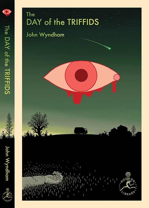
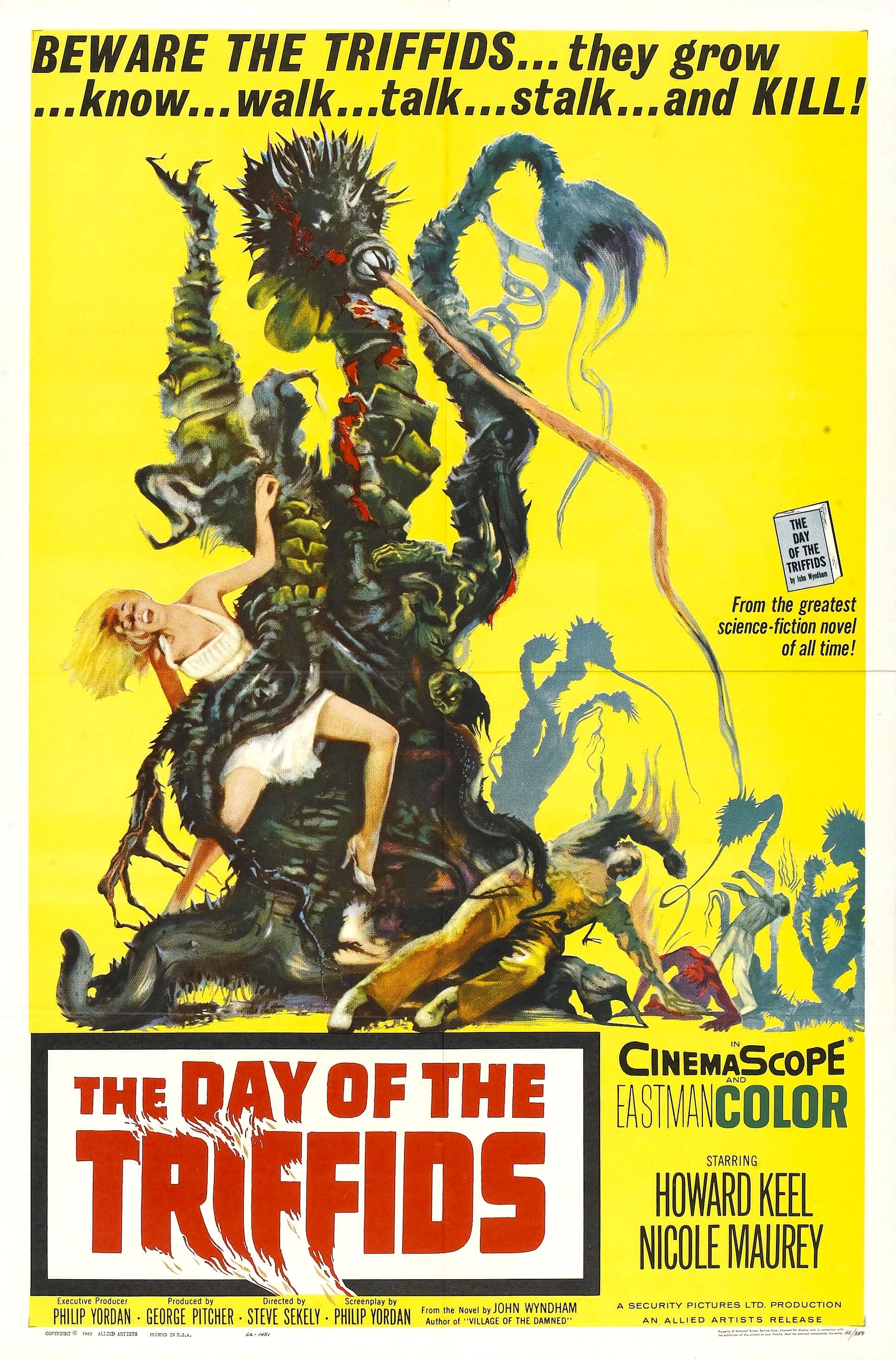
Last year I was asked by Robbin Schiff at Modern Library if I’d be interested in doing a series of ten book covers for a re-issue of the work of John Wyndham. I’d never heard of Wyndham, who turned out to be a English science fiction writer from the mid-20th century. But one of the titles was familiar to me. There was a movie made out of it in the sixties: The Day of the Triffids. I remembered the cover of the VHS tape from my local video store when I was a kid. Very campy, but… it stuck.
I’m not alone, Wyndham is not as well-known in the states as he is in his native Britain, but he was actually pretty highly regarded, apparently, and interesting. The entire genre of post-apocalyptic fiction arguably starts with Triffids, as does the now well-worn trope of a story starting with a patient waking up in a deserted hospital, having slept through the end of the world. And he was curiously prescient in other ways, too.
So I took it on and started reading. I’m still working on them – I’ve finished seven, now, with three yet to go. The books are very much my cup of tea in some ways, even if there are some definite cultural anachronisms, as is probably inevitable for an author writing fifty or seventy-five years ago. There is frequently some main character preoccupied with the philosophical implications of whatever is going on around them, for one thing. Many of the books might be described as proto-feminist, with central female characters pushing against the social assumptions of their gender. Margaret Atwood has cited him as an influence, as has Stephen King.
I actually got the first email from Modern Library a couple of weeks after finding a bunch of sci-fi and fantasy book covers at a flea market in Long Beach, and posting them to Instagram. I don’t know if Schiff had seen these or not, but my brain was already going there, apparently. And it’s been fun to play with these stories, as well as to play in the sandbox that is the history of sci-fi book covers, generally.
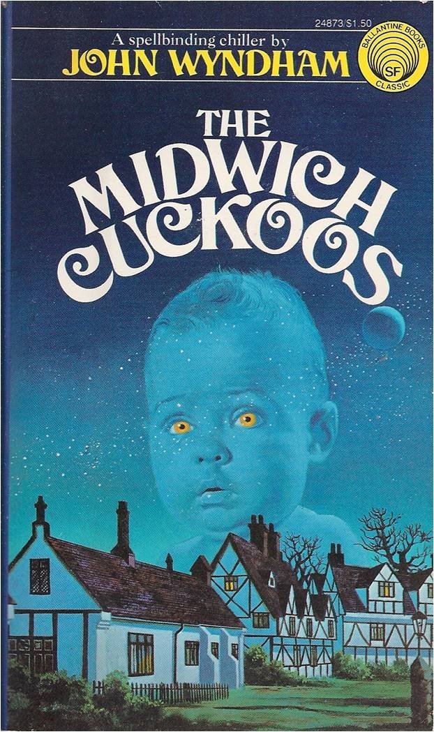
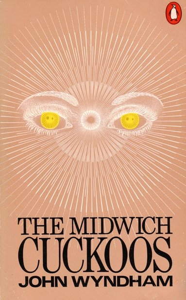
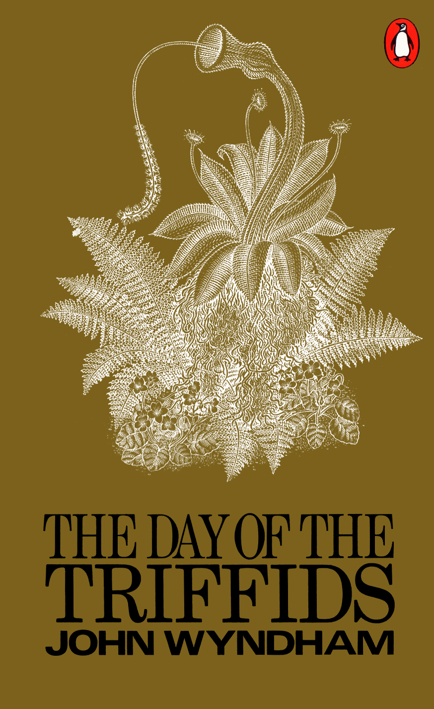
So I’m going to post a few of the covers and some of the sketches as well here, starting with the first three. the cover for Day of the Triffids (1951) is above. I started with that and two others: The Midwich Cuckoos (1957) and The Kraken Wakes (1953). The Midwich Cuckoos has been adapted for TV a few times, apparently, as Village of the Damned, with a new version in the works now in the UK).

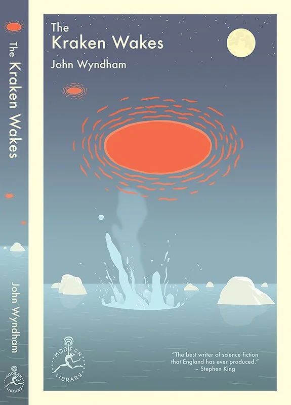
You might notice the central ‘eye-shaped’ objects in Triffids and Kraken. Inherent in the brief was the idea that the ten books would be a sort of set and therfore ought to share some common elements to unite them. Which is something I hadn’t really done before. In the end the A.D./editors didn’t choose the companion ‘eye’ design for The Midwich Cuckoos (see below), so that didn’t become a throughline. Which is probably for the best, since not every story lends itself to that design. The border and title treatment end up being the main common elements, though most of the first books have a horizon line of some sort around midway, and the atmospheres and use of color seem to have something in common, too. Here are a couple of the sketches for The Midwich Cuckoos that might have taken things in another direction:

I really did like the weirdness of the one with the baby. They had asked me not to go too far in the direction of ‘horror’, which… I don’t know, maybe horror is in the eye of the beholder, but they ended up choosing the bloody eye for Triffids, which I was happy about.
The books themselves, as I said, really do seem to still be strangely relevant. The Midwich Cuckoos (spoilers to follow) is about forced pregnancies (see the current rolling back of abortion rights?) and could easily be seen as bearing on immigration paranoia and generational disjuncture. The Kraken Wakes touches on the melting of the poles, and environmental catastrophe (albeit not of human making), and Triffids very much exhibits the trauma of the recent world war and is a sort of warning about technological hubris, including genetic engineering of plants. And they are all products, to some degree, of the cold war as well, which… also may be coming back in some small way. Certainly Wyndham’s work is promoted this way on book jackets. But ultimately these echoes into the present feel, at least to me, like a historical-literary curiosity more than anything. He did seem to be a keen observer, but it’s hard to miss the ways he ended up being off about the things he was, in other ways “right” about. Predictions are hard, as they say, especially about the future. In the end the books succeed and/or fail on their own terms, regardless of the time you’re reading them in. Of this batch, my favorite was Cuckoos. It’s just truly creepy in kind of a unique way.
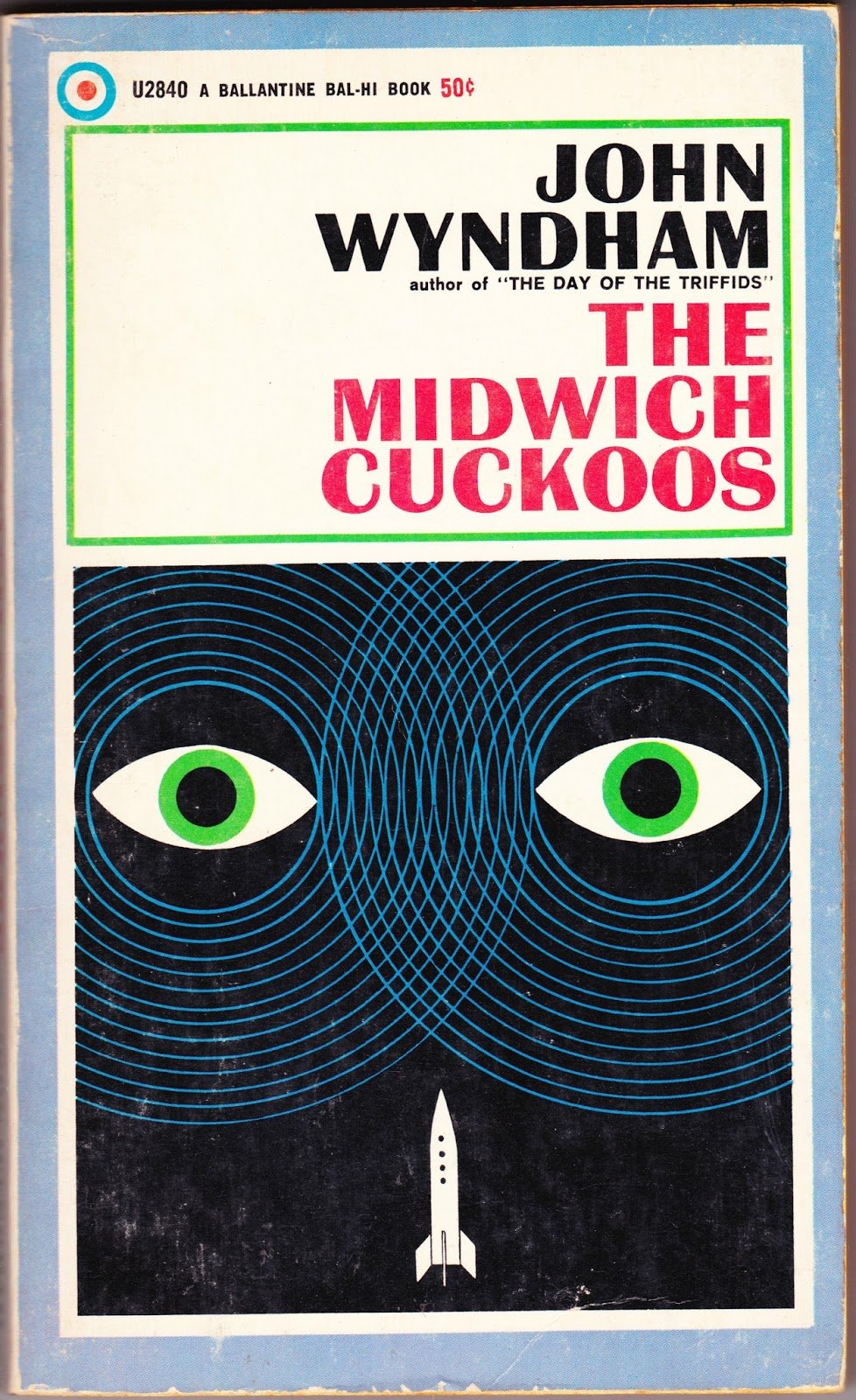
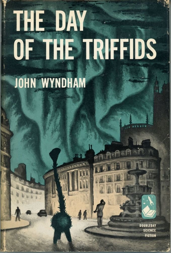
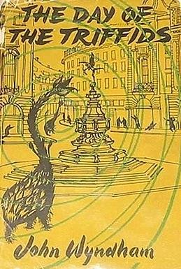
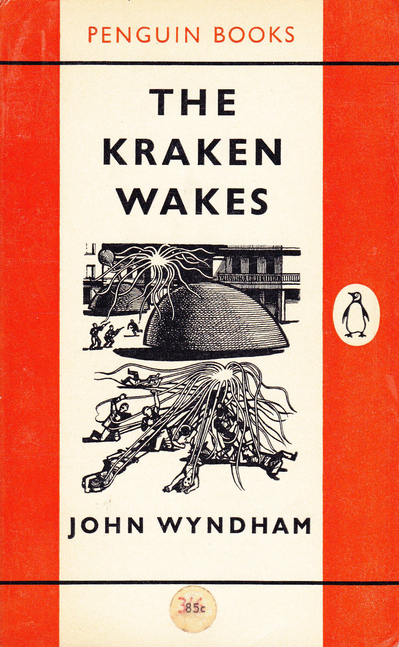
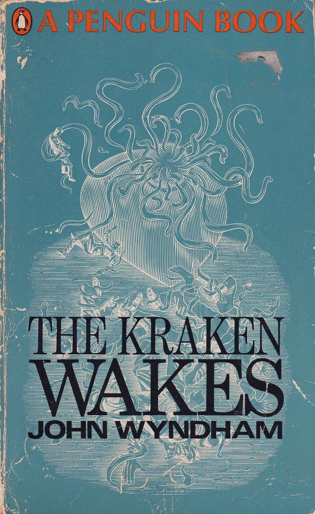
Here are a few previous covers by other artists that I liked. Including that movie poster.
Oh, and I even got to design an altered logo for the series. If you look closely, she’s got a little astronaut helmet and antenna. For sci-fi.
I’ll post more of the covers soon.